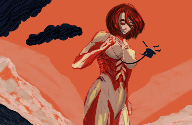
1st Digital Painting in Photoshop-Learning Experiment: Female Titan

female titan painting cropped

The Internet Wants You To Think Everybody is Immediately Amazing at Art

I wanted to try digital painting in Photoshop for a while, but didn’t have much time to really learn how to do it and explore different techniques. Whenever I would watch “How-To” Youtube videos, everybody kind of does things differently, or they all have their own custom-brushes, or super-fancy tablets, and it kind of seemed overhwelming at first. The majority of those artists are just good already, which is of course the goal, but I also like to see the development and growth of artists, which is what my project is about.

This painting has technically been a year in the making since I started it July 2017 in Illustrator. I created the vector outline of the Female Titan and attempted to color it in Illustrator, but abandoned the project because I felt like it needed to be textural and raw-feeling, which would be better achieved in Photoshop. The idea of doing a digital painting in Photoshop seemed daunting and I knew it was going to take some time. My procrastination was what made me choose it as my personal craft project for my Interim Collaboration with Vidi Global, because I knew that I needed to be pushed to do it to get over my own anxiety on trying something new.
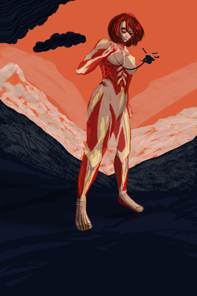
Female Titan Digital Painting
My digital painting of the Female Titan

The Concept

The initial idea for the painting was inspired by the Attack on Titan posters made by Matt Taylor, which are awesome, and feature the Colossal Titan, but I thought, “I want a poster like that, but of Female Titan!”  because she’s a badass, and her character is someone I can relate to with her world-view and introversion.

Keeping it spoiler-free, what makes the Female Titan so interesting to me is her motivation and insight about the world she is living in. Even the entire story of Attack on Titan has some over-arching themes, and then when you add that I had watched season 1 of WestWorld to it, it led me to start thinking about the following concepts:

  • Being human or being a monster, is there a difference?
  • Robot/machine influencing the human factor of the artwork.
  • Losing humanity through technology, though technology is guiding people and influencing people creatively.
  • Ability to enhance human performance/creativity with technology.
  • Monsters that are human, exploiting human weakness. Knowledge of their own weakness helps them to become stronger.
  • Become aware of the reality, who are the real monsters? What is the real threat? More than what you see.
  • Are your dreams misleading you? Are your dreams your own, or are they manufactured by the reality/culture you live in? Is that what you really want? Is that actually going to make you happy?

Those themes are influential to my artwork at the moment, and have also helped me to start seeing the world differently, as far as what is corporate manufactured bullshit and what I should actually be pursuing. Through technology and art, I can manufacture my own digital reality and create my own opportunities. I’m done trying to fit into a cookie-cutter mold, and in a sense I’m “not playing soldier” anymore, similar to how Female Titan is. (Though, ok, technically, I do still have to fit into a mold at my full-time job, and it does suck, but that’s more motivation for my artist-self to not do that anymore.)

The Process

I did start off trying a small painting first, which came out pretty good, because I did it immediately after watching a bunch of tutorials and followed the correct steps.
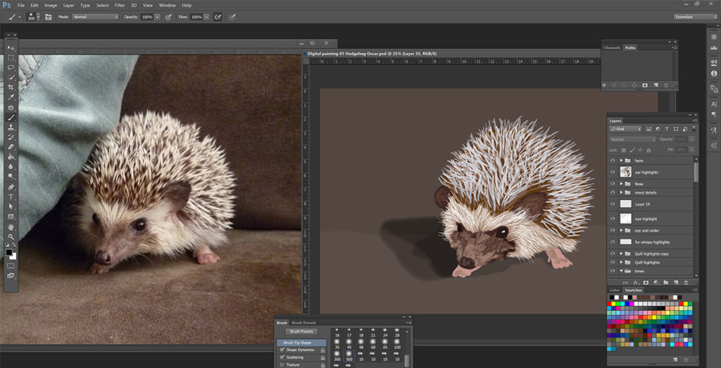
Digital Painting of Hedgehog
Small digital painting I did first to get the hang of it.

What You’re Supposed to Do

If I had looked at my planning notes at all when I was making the Female Titan painting, then I would have seen this is what I should have been doing:

Organization of Layers.
In order to make it easier on myself I will need to keep layers organized.
Name the layers.
Group the layers into folders.

What I can gather so far is that the layer order may go something like this:

01. Line work

02. Flat color (use as few colors as possible)

03. Tones

04. Shades

05. Highlights

06. Effects.

I mean, I started off ok, but then I jumped into the shading and highlights and effects too quickly, because I got impatient. I also don’t have a great sense for light source, I need actual references to look at while I’m painting.

What I Actually Did/My Mistakes

The TL;DR list of my mistakes:

  • Made file size 600dpi to start, which made it a large format file and made my computer go slow. It also changed how the brushes looked.
  • Used a million layers, which led to me not being able to find what I was looking for to edit and also made my file larger.
  • Should have gotten a better handle on brushes first or saved my own file of brushes as I went.
  • Should have watched more tutorials (when I was feeling stuck, I went and found some that really helped, especially on backgrounds and how to draw feet).
  • Should have upgraded to Photoshop 2018 before even starting since it has much better brush control settings.
Progression of Female Titan Painting

Watch Me Suck at Drawing Feet

Here is the speed video I made showcasing most of the process:

The video came out accidentally slightly trippy, hopefully it’s a chill experience for people to watch, especially if they love seeing terrible drawings of feet.

This was also my first time using Adobe Premiere Pro, which was a challenge in itself, but thanks to Youtube I was able to figure out how to do basic editing and even made some animated titles and music fade-outs. Windows Movie Maker was so much easier to use a few years ago, but this is the future.

Another first for me was recording my computer screen, which served its own challenges. First I tried installing Quicktime on my computer, but it wouldn’t install all the way, so I had to research other options for Windows. I tried using the XBox app, but that didn’t work well for me either, I can’t remember exactly why though, it may have had to do with the menu bar, and I hate how even now it will randomly pop up on the screen saying “press whatever button to start recording.” So finally I found Flashback Express 5, which also was a pain-in-the-ass in that the window disappears sometimes, but I figured out if I closed the program and reopened it after each recording, it wouldn’t do that.

Recording my desktop also made my computer go super slow, along with my mistake of making the Photoshop canvas enormous to start. It was the right poster dimensions, but I made it 600 dpi because I’m just overly paranoid and want to be able to crop things, but 600 dpi was way too big, it’s not going to be on some giant billboard, 300 dpi was all it needed to be. Once I was fed up with my inability to do anything, I resized the painting to 300dpi and continued from there, which helped a LOT. It still went slow as I increased the amount of layers and the file size though, which was another mistake I made, I didn’t need 2000 layers, and I shouldn’t have used a million layer styles either. It’s my fault for not really liking the initial color scheme I chose, I didn’t really plan it very well I guess, I thought the green color was going to look good, but meh. At least I was able to make it red and beige and it turned out really good in the end.

Also, I cannot draw feet, half of my time was spent trying to make the feet look ok, and even in the anime and manga, they avoid drawing the feet often, or in other artwork, people somehow simplify it, but I couldn’t get them to look right. Finally I thought maybe if I add shading it will help, and that was the main thing it needed. The feet do look a bit over-worked in the painting, but idc, they look like feet for the most part and I don’t cringe when I look at them. Plus Titan feet are slightly different than real human feet, but for people unfamiliar with Titans, it was going to look off.

In my own head as I was painting it, I kept thinking how bad I suck and can’t do anything right, but I mean, this was my first digital painting, and I was trying to cut myself some slack, but it got frustrating, along with the computer not always responding to my inputs immediately, it was a pain, but I didn’t give up and it makes the finalization of the artwork that much more satisfying.

Oh yeah, also because recording slowed down my computer, I started to try different things in the painting without recording it, so every now and then you may see that all these other layers are there suddenly, but I probably hated whatever the outcome was and didn’t use them ultimately. And sometimes I would record an hour and the computer would crash and I lost the recording, so the video isn’t always seamless. Also with using the Flashback Express recorder, once I was done, I had to convert the files to Mpeg4 files in order to edit them, which took a day and a half, so the process was elongated.
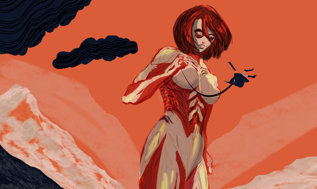
female titan painting cropped
Get a grip on digital painting, like Female Titan is with that dude.

Ok So is Digital Painting Even Fun?

Yes! I am glad I tried it, and you should too! Learn from my mistakes, start small, and don’t beat yourself up if it doesn’t come out right immediately. It’s digital, it can be edited and manipulated, colors can be corrected, shapes can be changed. Don’t be intimidated by technology, even though it doesn’t always work right all the time. And don’t be afraid of people making fun of derpy feet.


Continue Reading

WP Project: Progress check…how are your templates coming?

Since WordPress and PHP are a lot more complicated than plain HTML and CSS, we were fortunate enough to be given the choice whether to continue trying to learn PHP or to code our portfolio websites using only HTML and CSS markup. I have been watching this WordPress 101 tutuorial by Alessandro Castellani, which is really good, I’ve watched up to part 7, but then there’s a Q+A session video he did where he got into the CSS styling of the nav, which was necessary to watch in order to start understanding how everything comes together. I’m really only up to part 4 when it comes to following along and inputting the code, but I’m starting to see the bigger picture as to how it all works, though I am still uncertain about how the content gets managed, does WordPress save your content to a folder on your computer when you upload it, or does it only get saved online…I’m not at that point yet, but I guess I’ll figure it out. I was freaking out a bit 2 days ago, I’ll post my draft in tiny text below. I have had to watch the videos multiple times to actually understand what he’s doing, so it is taking some time, but I understand the whole “making a template” concept now and how WordPress uses PHP to pull in sections. In the videos he says “it’s super simple” and “don’t give up” so I am continuing to get this thing to work. I have the header and footer working and styled, so now it’s a matter of creating the templates and assigning them to the pages. I’m still a bit iffy on links though, like my home page will have one link in the content that invites you to explore the website and it will take you to the portfolio page, so do I need to assign that link through wordpress? I think so since the pages are created via the wordpress interface…I’ll get to that I guess lol.

I don’t really love the wordpress dashboard interface, you have to go to 4 different places to change one thing, like if you don’t want the blog on the homepage, you have to go down to “settings” then “reading” then change something on there, it just seems counter-intuitive when you’re dealing with a “pages” menu, and then a “menu” menu. Oh and you have to go to appearance to go to menus, but why isn’t that under pages? Anyway, I would design the UI of WordPress a bit differently, but maybe they want it to be confusing on purpose.

My freakout from 2 days ago which is irrelevant now, just as a reminder that everything is going to be confusing at first, but I shouldn’t get discouraged:

as the videos go on and the functions.php code gets larger, it gets more complicated, and then with the way the menus work, they get called to the page by php, but then I haven’t gotten to the part where the menu/nav gets styled yet…I made it to part 4, but post loops seemed php heavy. Then I skipped ahead to part 14 where he edits the menu using “walker class,” and it seemed like it was beyond my scope at this point, but of course I got way ahead of myself. Part 2 gave me a bit of trouble, I think because I started with the theme as a child theme, but his videos start it from scratch, but from what I can tell, the only way for WordPress to see that it’s a child theme is if you declare a template in the style.css file, and I had taken that line out, but my page was still loading twentysixteen code, and I’m not sure why. I was finally able to get the functions to load my stylesheet, I had to use get_stylesheet_directory_uri(), but I’m just afraid that if something goes wrong with the site that I won’t be able to maintain it properly or fix issues quickly enough. The menu system is also weird to me, since it’s a portfolio website, would each category on my portfolio menu need to be it’s own menu? It would be several different pages of menus, I think. On the other hand, having the WordPress template and plugin functionality for the entries themselves would be good, it would be easy to layout each individual project and have several options to choose from.  I don’t want to give up on php just yet, I’ll follow along on the vids a bit longer and if it comes along then great, if not then I should be able to code the site the old fashioned way pretty quickly, hopefully.


I will say though that in the videos he is using Bootstrap for his CSS and I’m not going to use that, so maybe later on I may get more confused, but I can see that WordPress is making default classes on certain things, and then you can make classes false in the php code. I did need to do that to get my nav styled right, but later on if other things don’t show up right, I’ll have to remember to try that on other bits of code.

Continue Reading

Freeform: Blog about any topic related to web design

I’m going to talk about 2 things: Web Brutalism and CSS Animation Effects, both topics are related to user-experience.

Web Brutalism

The latest trend in web design is called web brutalism, which is the total lack of concern for usability and making things look weird and crazy on purpose. It is a reaction to the clean, minimalist, even hipsterish websites that people have become accustomed to.

This website has an extensive list of brutalist websites to explore.

Now, these websites are NOT for a broad audience. You would not want to implement any of these designs into a website for banking or a medical facility, any site where all people need to find and access information quickly and have usability be easy, which is probably 99.9% of websites. BUT, for people who are interested in web design and/or art, or people who are a bit weird and quirky, these sites are fun to browse, just to see what odd stuff can be done on the web. For example, this website turns your cursor into a writing tool, allowing you to write on the screen. You can even play tic-tac-toe with the website. Is it easy to use? No. Does it have an aesthetic that people are used to? No. BUT even though it is difficult, it is fun to scroll and navigate through, trying to figure out what is clickable and what does what, almost like a video game.

So even though you’re not likely going to put giant neon green text on most projects, it’s still worth going through some of the sites for inspiration. See if you actually enjoy any of them and if you have fun. If so, think about how you can implement that fun part of the user-experience into your next website, or how you can make your site unique in a way that isn’t necessarily as jarring as some of those brutalist sites. There was still thought put into those designs to make them intentionally weird. I suppose there a few ways you can tell the difference between a design that is intentional vs. a design that is just bad. What is the intention of the website? Who are their audience? Does the color scheme look like it actually kind of goes together even though the colors are ugly? Are the font choices more than just default? Some websites may take it too far though. You don’t want to induce seizures on your users. Is the site fun or just ugly and annoying? There are some sites on that list that are annoying actually, so where is the line drawn for you on what is taking a design too far off the edge? These sites may also help you appreciate clean, minimalism.

I personally enjoy looking through the brutalist websites because I think they’re funny and I like that they are so different and don’t use the basic cookie-cutter templates and fonts that you see over and over again on most websites, though I understand that there is a basic formula that needs to be in place to keep the usability intact and information as accessible as possible for as many people as possible. At my old job I had to do a bit of research and I used to hate trying to skim medical or govt. websites looking for basic information, heading face-first into a giant wall of small text with no headings. You’re lucky if you get even a small amount of padding on most of those sites. Those sites are just bad, not fun to browse or use at all, nor easy, nor aesthetically interesting.

CSS Animation Effects

I do need to learn more about animation effects and how they work because I want to start implementing them into my designs, in moderation though. It is fun when things move on hover or when you scroll, though sometimes it can keep some content hidden if somebody doesn’t scroll all the way down (I am seeing this at my internship site, I upload the articles and images to their website and the images have a default side animation, they slide in from the left on scroll, but the text is always there. I try to lay out the content so that the text is usually to the side of the picture, as an indicator that there is more to see, but sometimes I have to turn the animations off completely if I think the article will look weird with a bunch of images not appearing right away.)

CSS3 uses the @keyframes property to declare what should happen during the animation. Then you can apply the animation when you style an element and tell it the duration of the animation and how many times it should run (the iteration).

This W3Schools post is good beginner information to start animations from.

You can also use transitions to animate divs, though that link shows it being done on hover.

This W3Schools post talks about 2D transformations.

I’m going to start playing with these techniques to bring my websites more to life and make user-interaction more enjoyable.


Continue Reading

What is a work flow? What’s your ideal personal work flow?

A Work Flow for web development is the process in which you design and create the website. There are a few steps involved in the process, and it differs a bit based on if you are starting from scratch or if you are redesigning something that already exists. Organization is the key, and it can get overwhelming if you’re presented with a ton of unorganized information that you need to make sense of. My ideal personal workflow is:

  1. Define client needs and audience.
  2. Research what competitors are doing, what’s working, what’s not, and draw inspiration.
  3. Organize the information and figure out the sitemap.
  4. Research fonts and color schemes, make type and color studies to see what will fit the mood of the website and match the client’s branding, what will appeal to the target audience?
  5. This is the part where you’re supposed to do wireframes, but I actually really just like to start comping right away with actual information/data that will be on the website, so I can visualize what it will look like and how everything will look altogether, colors, fonts, images. Create a few mood boards, determine which one will fit best, then from there start determining the layout. I can gain a good idea of what the layout should be from doing that, then do wireframes if needed.
  6. Get approval and start coding. It’s probably a good idea to get your HTML organized first, then start styling in CSS.


Continue Reading

Plug-ins: What are they and why are they important?

Plugins are pieces of software that can be added to a WordPress website. They contain a group of functions that can add new features to your site and extend the functionality. They are written in PHP programming language and can be integrated seamlessly with WordPress. WordPress users can make their site cool without knowing advanced code. They are important especially for people who don’t know much PHP programming, but want to have a sleek, modern website.


Continue Reading

WP Project: Present your comps

This week our WordPress comps are due and the project has been a bit stressful. I fluctuate between wanting the site to be creative, but also wanting it to be clean and classic. I don’t want too many colors or distractions because I want the focus to be on my work, yet at the same time, I do need to figure out my own branding, color scheme and mood and it needs to be reflected. I do want there to be a giant hedgehog on the site, and I spent a lot of time trying to figure out what that should look like. I’m really liking glitch art right now too, so I experimented with some of those techniques on a drawing I did of my old hedgehog Boo Boo, and I used the color scheme I have tentatively decided upon, which is very bright and bold, but it’s so I can get a pop art feel. I did finally have a breakthrough with the art, and it does embody the spirit of what I am going for. It looks like something out of the 80’s, like it would be in an old IBM computer game or Street Fighter. I might redo the hog drawing though and redo all the digital effects, but it’s good for now and at least I have a clear direction now. The website design itself was also a bit of a mashup, and what was stressing me out is that there are so many ways the portfolio page can be done, what is the best way? What is the compromise between everything being easily accessible, vs the site being fun to interact with? Even some of the sites I looked at for inspiration did start to annoy me once the initial novelty of seeing something unique wore off. Because though those sites have an interesting menu interface, they don’t make it easy to go back to the landing pages for each category, so having to click a lot does become annoying, but the pages are pretty and most people won’t be going back to the pages a million times to look at minute details on how they laid out a button or some other UI detail.

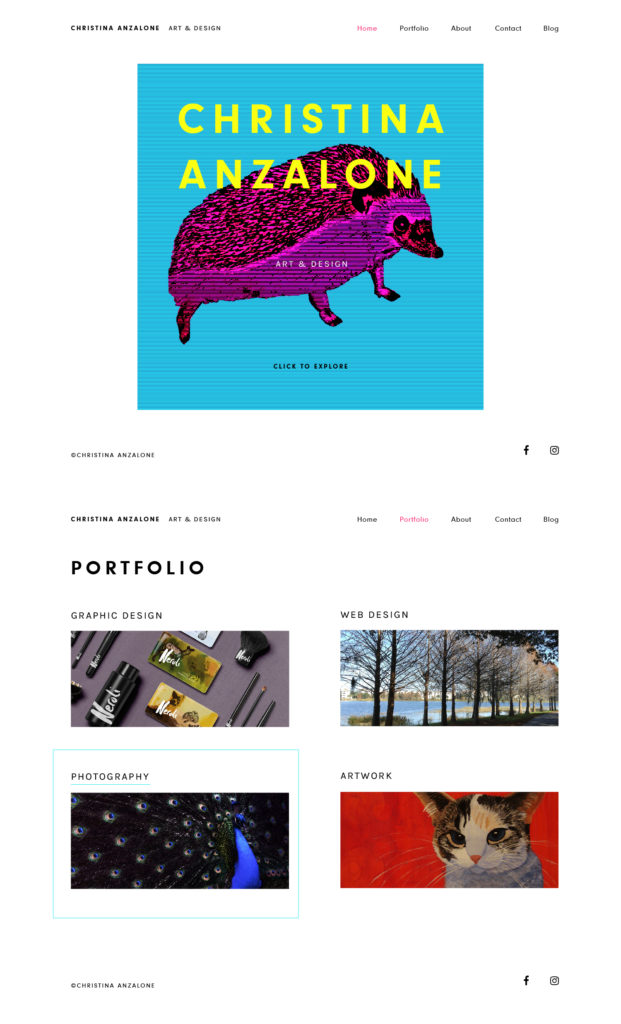
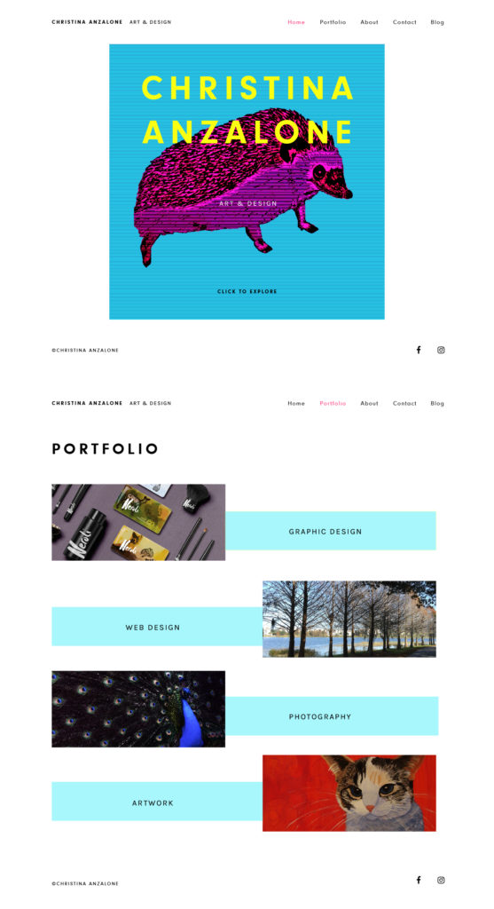
Anyway, I’m happier with my font choices now, though the main one seems to sometimes not translate to jpeg very well. I think the layout and functionality of the site is there though. I made 2 different Portfolio landing pages because I’m indecisive. But look at that pink hog though.

home page and portfolio page version 1 Homepage and portfolio page version 2 comp of many pages

Continue Reading

Mid-term checkin: How’s your semester going?

It’s going ok, my internship is good, I’m interning at a local magazine and enjoying article layout, also learning about making posts via Word Press there. I’m surviving classes, it’s all web this semester so I have been able to wrap my head around a few code items that I had encountered in previous semesters but didn’t understand what they were talking about, such as psuedo classes, before: and after: and content: “”. I now at least know what is happening if I see that in a code example. I am also starting to use animations more, which is fun, though still have more experimenting to do with that. I’m now a bit better at dissecting plug-in examples and figuring out how they work, though it takes me a while sometimes if the code is extensive. I try to recreate the example that is online first, then once I know that works, I go and try to fuse it into my own project, but that has it’s own challenges. Making sure you have all the javascript linked correctly, figuring out which classes need to be restyled in CSS, figuring out how to change all of it when it goes responsive…it’s a bit exhausting and daunting, even with the inspector, which also doesn’t always work correctly with resizing and viewing mobile sizes. Anyway, when things finally DO start working and doing what you want them to do, it’s even more rewarding. I’ve also been trying to figure out my own branding on top of that, and I’m so indecisive, I drive myself crazy. There is a lot of pressure for it to be awesome, but I’ll talk more about that in the next post.

Continue Reading

Working with Responsive Images: What are the Pitfalls?

Some pitfalls of working with responsive images are:

  • Some may need to be repositioned within a div as the screen gets larger or smaller .
  • You have to make sure your image has a decent resolution if it is going to be full-screen, but not too big where it will eat data/bandwidth.
  • Some screens use retina display, and you may need to have 2 versions of each image so that retina displays can see the higher resolution one.
  • If an image is not working, you need to have a background color as a fallback.
  • If text is on top of the image, the readability of the text may be based on where it’s located on the picture, which again means you may need to reposition elements as the screen gets smaller, and consider what would happen if the image gets switched out with a different one down the road, the text still needs to be readable.
Continue Reading

Why it Might Be a Good Idea to Always Use a Type Kit Instead of External Linking

I was searching to see if Lato font uses ligatures and I stumbled upon this troubleshooting page from a month ago, where suddenly Lato font had been updated on Google Fonts and people’s webpages were looking off due to the x-height change. They ended up reverting it, but the lesson is that they can change the appearance of fonts at any random time without notice, which could result in broken, ugly pages and alignment being off.


Continue Reading

Web Design vs Front End Development: What’s the difference?

From what I have read, the job duties can be similar or vary drastically from one employer to another. Personally, I would say that a web designer is the person who comes up with the visual presentation and organization, overall aesthetic and layout of the website. Depending on the client, they might come up with the entire branding for the company, or they may have to use the branding that is already in place, and figure out how to best integrate that identity with the information that the audience will be looking for on the site. Graphic Design itself seems like it blurs into the marketing field, but that’s a different topic. Anyway, a front-end developer would be more code-oriented, they would be more into computer science and would probably have advanced knowledge of HTML, CSS, and Javascript. Web Designers also typically know basic HTML and CSS, and have an understanding of what is possible to achieve with Javascript. Likewise, some front-end developers could also design the user interface of a website.

Continue Reading