WP Project: My Personal Style and Element Collages

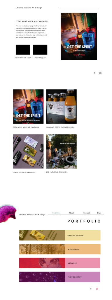
For my Word Press project, I put together 2 element collages, but I ended up disliking both of them. I had done a lot of type studies, and research, and I thought I had a few good options, but when I put the fonts next to pictures of my work in my collages, they didn’t seem to work well. It could be that I had just stared at it too long, but the overall mood was feeling boring. I like white space and simplicity, and that is necessary to an extent if I want my portfolio pieces to stand out and be the focus, but I want my website to be fun and interesting. At the same time, I was working on a redesign of the Yale School of Art website, and I put most of my creative energy into that project, but a few of the elements I used for that design actually are reflective of my style and personality as well. I didn’t want to repeat things for both projects, but now I feel like I have a better idea of how it should look. Pop Art hedgehogs is what I would actually want, but it needs to be a bit of a balance between fun and professional. I think most other graphic designers might be bored of the usual stuff too though, web design is a bit homogenous, and it’s tempting to go overboard with the wackiness, but you have to remember function and basic framework. It can be functional and fun/artistic at the same time, I just need to get the balance right. Here are my element collages that I don’t like that much, but at least it was a start:

2nd element collage for my websitemy element collage for my website

Continue Reading

Researching WordPress Themes

In researching WordPress themes, it’s hard for me to like most of them, I think because they all look generic and most of them follow the same format of the giant  full-screen hero image, followed by 2 or 3 columns of text, or text and images, but of course those types of layouts are useful and are what people are used to interacting with, so most people will choose those. On the other hand, I don’t like when websites try too hard to be completely different and new, because the user (me) has to take a few minutes to figure out where the navigation is and what does what, and how the information flows. I think most people want to be able to find information quickly, and have it presented to them in a pleasing, organized way. It depends on your audience too, what type of people are using your website, if it’s high-tech people then they may like all the flashy new, harder to use websites with videos that play automatically, but typical people don’t want to be bothered with that, especially if they are in a hurry. Also, a lot of the WordPress theme previews use a generic sans-serif fonts, which don’t help their appeal, but that is the point of them, to be a blank slate for the business to customize, so you have to look beyond that and see their potential, almost like a fixer-upper house.

Anyway, in general I was attracted to the themes that use black and white as their base, with one accent color. It keeps it clean and simple, elegant, yet modern.  I want to have my website be something along those lines, and maybe use one line of color, or maybe it will have one giant background image with an opaque overlay, and then have white boxes of text, with pictures, and a black and white nav at the top, or a black side bar nav…just brainstorming really, need to draft it up.

Rikke was a good theme, mostly black and white, Zeal is nice, it uses black as it’s main color and uses giant images with an overlay to tone them down, like what I was thinking about above. For now, I chose Olsen Light as my theme because I like that it pairs a serif font with a sans-serif, uses black and white, and is straightforward and to the point, when it comes to reading a blog. I like the content/posts on the left and the other info in a small column to the right, probably because people look to the left first when reading so it makes sense. I also like the use of line elements, it reminds me of something Vogue would do.

Continue Reading

Introduction

My name is Christina Anzalone, I am a graphic design print & web student, who will hopefully be graduating Fall 2017. I love coffee and have a pet hedgehog. Along with graphic design, I enjoy painting and drawing, and try to incorporate my art skills into my projects. Publication design and article layout are my favorite aspects of the field, as well as photo editing. This website is currently a work in progress, so stay tuned!

Continue Reading